TAC Projects
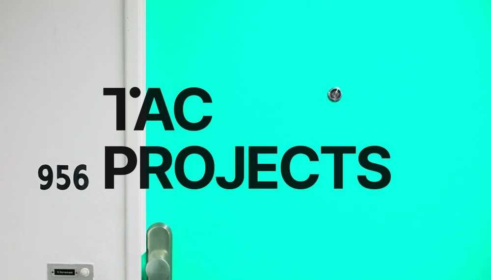
“Somewhere between town and country.” Logo design for TAC, a renovations and building company based out of Lyttleton.
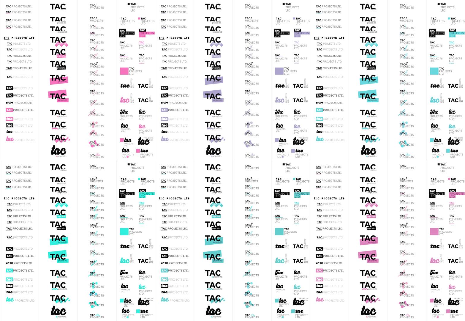
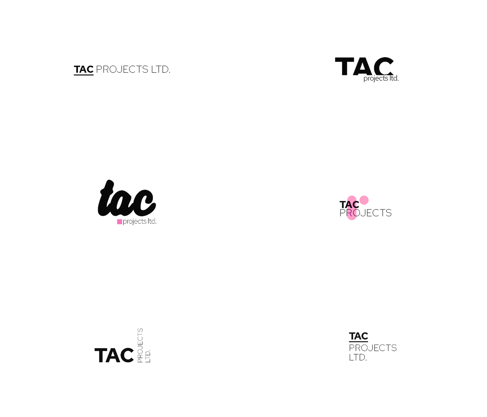
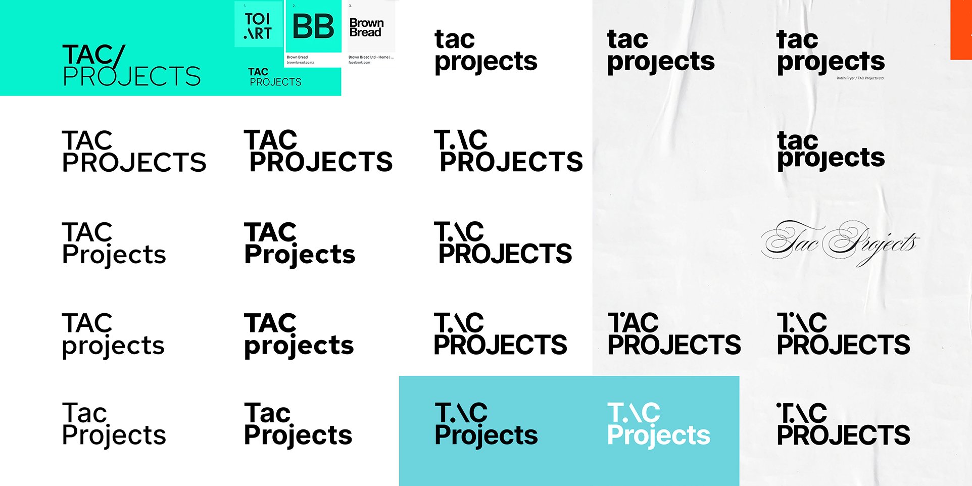
The client wanted a simple, text based logo, basic and black. I produced well over 200 concepts and developed versions. Adding poppy spot colours to temp my client with. Together we churned out a logo we both loved and thought represented the company well and was appropriate within the wider industry.
Date: 09/05/2022
Client: TAC Projects
Role: Designer, Logo design
URL: tacprojectsnz.co.nz
Instagram: tacprojectsnz

TAC Projects
“Somewhere between town and country.” Logo design for TAC, a renovations and building company based out of Lyttleton.
The client wanted a simple, text based logo, basic and black. I produced well over 200 concepts and developed versions. Adding poppy spot colours to temp my client with. Together we churned out a logo we both loved and thought represented the company well and was appropriate within the wider industry.
Date: 09/05/2022
Client: TAC Projects
Role: Designer, Logo design
URL: tacprojectsnz.co.nz
instagram: tacprojectsnz


The client's touch
Robin from TAC Projects was stoked with the logo, he has since through social media expressed his own branding style, establishing the identity he foresaw for his company — It was also a nice surprise to see the logo printed onto his work trucks.


